Winter is the quiet time in this part of the world. But that does not mean work stops for anyone who is awake and needs to keep warm! The daily rhythm of feeding the woodstove, the cats, the birds and then sitting down to do my work has a comforting and simple cadence. When warmer weather comes, it will be more of a speedy dash to just keep up with spring bursting forth, but for now, we who live close to the earth know that this is the time to take on important projects, dive deep into thoughtful reflection and if at all possible, finish creative efforts that were put on hold.
I have just such a project which has been on a back-burner for far too long. It began years ago with a Kickstarter fund-raiser and I’ve had to put the project on and off again so many times it’s begun to sulk in the corner, feeling as if it will never have wings. I knew that when I said “Yes” to my Fairy Houses book with Quarto publishing, that my own personal book would have to take a back seat…but I never imagined it would take this long to bring back into active status once more.
Thankfully, the experience of working with my editor and all the production crew for the Fairy Houses book has taught me a lot. AND, what is also true is that my fairy house and environmental art-making never stopped, so there are literally hundreds of new images that need to be reviewed and considered for inclusion in my new book which I have titled “Enviramagination”. This has meant basically going back and starting over…never a fun way to pick up an on-going project, but it was necessary this time. My original image collection for the book was going to have to be reconfigured to make room for dozens and dozens of new images.
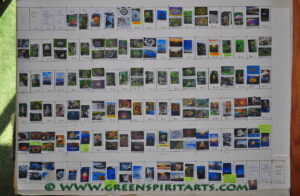
The first iteration looked like this in miniature:
I used hundreds of tiny thumbnail cut-outs to assist with the selecting process and to figure out how to piece them together to achieve the flow of images that I wanted. I had decided to use only two basic formats: either a large vertical or paired horizontals that would be on any page. But as I looked closer I realized that switching back and forth between only these two options made for choppy viewing…at least it felt that way to me. I tried adding a third squarish frame option and that helped smooth the transitions between strong vertical and strong horizontal images.
Next I tackled the backgrounds. Here is an example of one of the backgrounds I had previously developed for the book:
I had made dozens of these patterned backgrounds to echo the subtle transitions across all the seasons. While I loved the details and textures that went into making the various backgrounds, I made a sobering discovery: though they looked great on my monitor, when printed, the pages all became darker, muddied and the central images lost their power. This was very discouraging because I had invested a LOT of time in making over 2 dozen backgrounds that I thought were going to make a magical book. Instead, as watercolour painters will understand, I had too much “paint” in the visual mix and the results were a muddy mess. Production on the project halted while I assessed what to do. It was rather disheartening because I so wanted to complete the project, but it was a mess and I knew it.
Then Quarto approached me with their Fairy Houses how-to book concept, the contract deal was signed and I had to focus all my attention on that book. My own book project would have to wait. But waiting has brought many benefits.
With the new moon of last month I gave a serious review to all the old files and decided to send them all to the virtual shredder so I could begin with a fresh, clean slate. I had an idea to use very faint whispers of design elements in simple, pearl greys which would appear behind some, but not all of the page spreads.
I set about making some test pages and seeing how they looked on the screen and printed on the page. I am pleased to say that this approach has proven to be fresh and exciting and I’m now forging ahead with new vigor and enthusiasm.
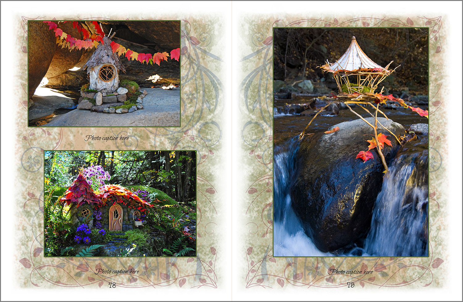
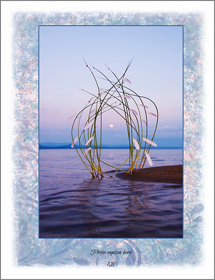
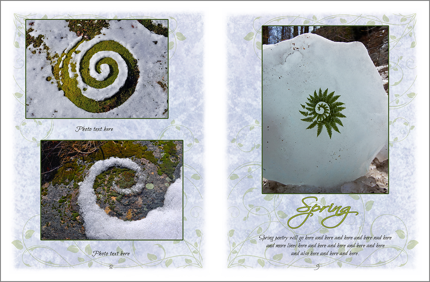
Here is an example of an old background (left) compared to the new background (right) :
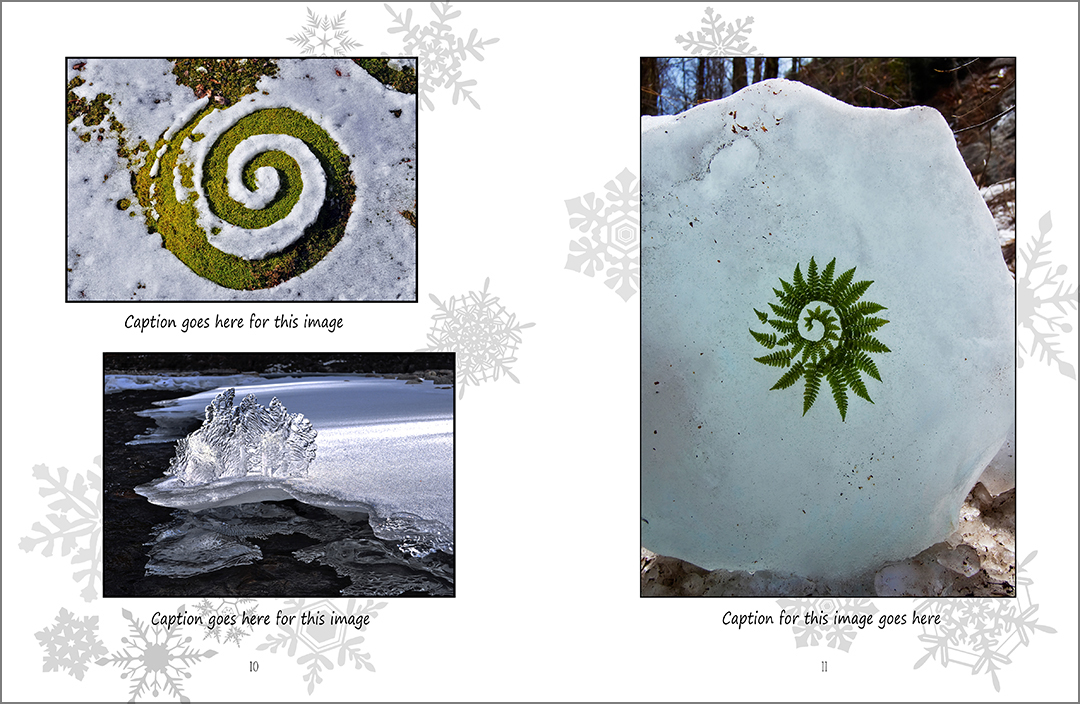
Here is another example with multiple images:
and here is the new layout with the fresh background:
I think this approach works much better as now all the color on the page is concentrated in the images which is where you want the eye to focus. And the subtle greyed design motifs will soften the overall presentation and add dream-like whispers to tie the pages together to follow the ebb and flow of the seasons in a more subtle way.
What is also of great benefit is that I have acquired some new photo-processing software by On1 which I have taken many months to learn how to use and it has enabled me to refine my images to a much higher degree and make them glow with depth and detail that I was unable to produce before. So not only will there be better backgrounds, but there will be more images which are distinctly better in quality than what I would have been able to produce a few years ago. I know the wait has been too long, but I hope that with all these improvements, the wait will have been worth it.
Now I must get back to work…. I have a book to create!!!





Sally – thank you so much for sharing your process with us! I am going through a reassessment of my next work, as well. It is nice to hear from a kindred spirit…
Your work is so unique and truly magical. I am looking forward to your book in print! I await an announcement.
My own work lately has been very colorful were shocked like pieces.
Thanks again for your generous share – – Dena
Thank you Dena and I apologize for not publishing your reply sooner…. I am still getting used to my new blog and website and did not see you reply waiting to be published! Where can we see your work? Is there a link you can share? I would be very happy to share it with the world if you’d like. And yes indeed, you will be among the first to know when the new book is done!!!!